Chart Types
Nullstone provides a set of pre-styled charts for common use cases. If a chart type (that is specified in module outputs) is not supported, Nullstone will fall back to a generic line graph. Each series will plot as a single line without shading.
TIP
Each metric provider samples datapoints at different resolutions.
Generic Chart
A generic graph is a "catch-all" chart used to present raw metrics in a line graph. Usually, this is used to plot counts for generic metrics (e.g. requests, errors, etc.). This graph is commonly configured with unit = "count".
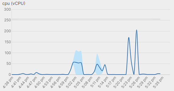
Usage Chart
A usage graph is intended to visualize resource usage in proportion to reserved resources. This is frequently used to plot resource usage (e.g. cpu, memory) of apps and datastores.
At the top of the graph, a gray line plots reserved to indicate the available resources reserved to the app or datastore. The main graph consists of a shaded band between the min and max denoting the extreme utilization rates in each time period. The average utilization rate in each time period is plotted as a single line through the shaded band.
Required metric mappings:
<metric-group>_reserved<metric-group>_average<metric-group>_min<metric-group>_max
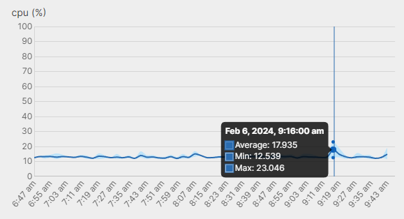
Usage Percent Chart
A usage-percent graph is intended to visualize resource usage as a percentage. This is frequently used to plot resource usage (e.g. cpu, memory) of apps and datastores.
The graph always maxes out at 100%. The main graph consists of a shaded band between the min and max denoting the extreme utilization rates in each time period. The average utilization rate in each time period is plotted as a single line through the shaded band.
Required metric mappings:
<metric-group>_average<metric-group>_min<metric-group>_max
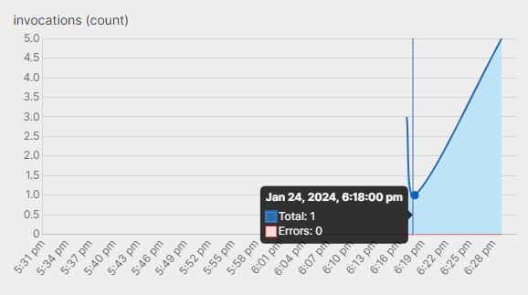
Invocations Chart
An invocations graph is intended to visualize the proportion of errors to total invocations for jobs/tasks. This is frequently used to monitor serverless functions or background jobs.
Each series (total count and error count) are plotted as lines with shaded area.
Required metric mappings:
<metric-group>_total<metric-group>_errors
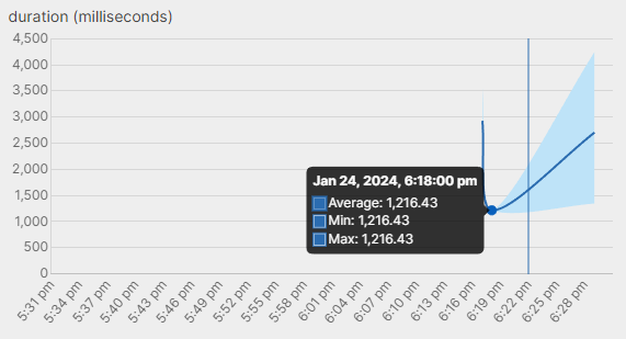
Duration Chart
A duration graph is intended to visualize how long executions take and how much they vary. This is frequently used to monitor the performance of serverless functions or background jobs. In particular, if the durations get high, it indicates an issue with datastore connectivity or app code performance.
The main graph consists of a shaded band between the min and max denoting the extreme utilization rates in each time period. The average utilization rate in each time period is plotted as a single line through the shaded band.
Required metric mappings:
<metric-group>_average<metric-group>_min<metric-group>_max